From Chaos to Conversation

Reimagining the field verification experience for on-ground verifiers — reducing cognitive load, cutting training time, and improving data collection accuracy.

OnGrid Verifier App screens
Role Research & UX/UI Design
Team 1 Designer, 1 PM, 2 Developers
Duration 1 Month

Context

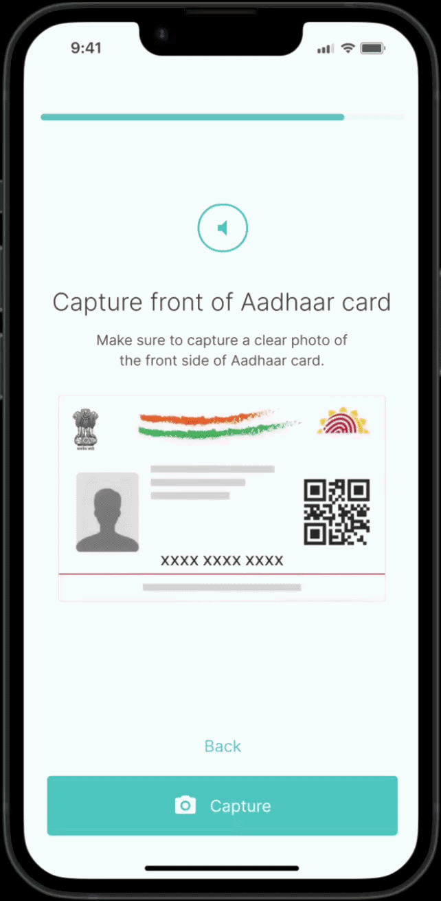
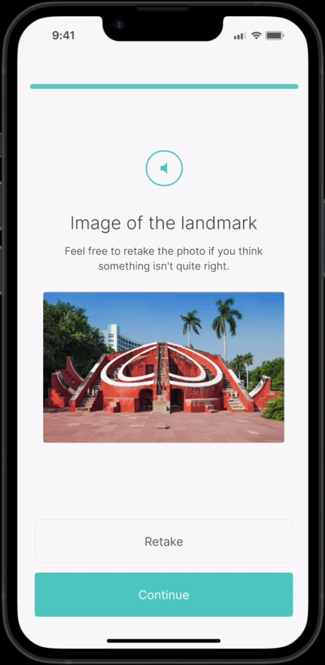
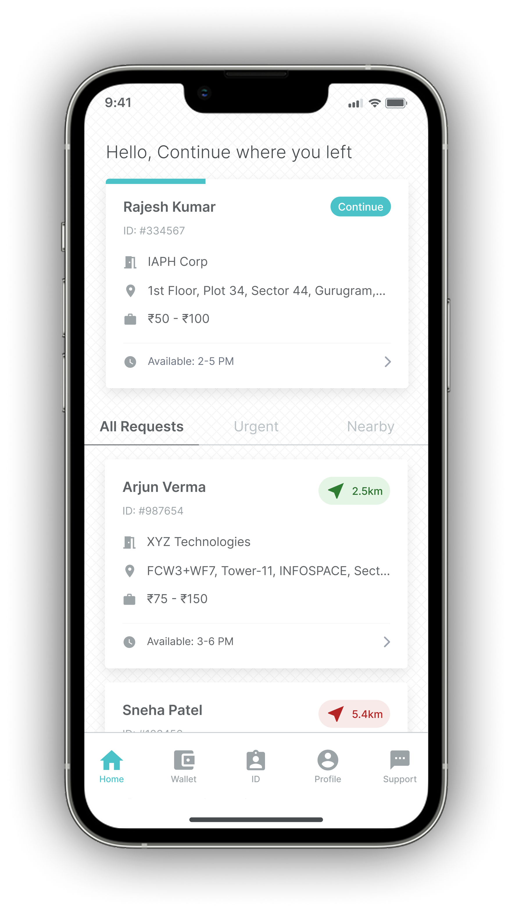
How OnGrid's address verification works

OnGrid's address verification product relies on a network of field verifiers who visit candidate addresses, collect information, and submit reports through a native Android app. The redesign was an opportunity to make this experience significantly more effective and easier to use.

Challenge

Three problems driving the redesign

Verifiers visit individual locations and use the native app to fill in information, upload documents, and take pictures. In observing this process, three major drawbacks became clear.

High drop-off rate

Many verifiers were abandoning work or were reluctant to engage with the app and learn the verification process

Incorrect data collection

Verifiers were frequently submitting wrong or inconsistent data, compromising report accuracy and downstream audit quality

Heavy training burden

Ops executives had to spend multiple days training each new verifier — creating a bottleneck that didn't scale

Goals

What success looks like

User goal
  • Quickly and comfortably complete address verification of an individual in a single visit
Business goal
  • Improve TAT (turnaround time) of address verification
  • Reduce time and cost spent on verifier training
Approach

Six-phase research and design process

1
Secondary Research
Kick-off meeting · Audit

Getting aligned with the team. Learning about the current experience through internal documents and an app audit

2
Primary Research
Stakeholder interviews · User interviews

Understanding product vision, constraints, and verifier needs and behaviour in the field

3
Define
Persona · Experience map

Identifying user needs and pain points, communicating where we needed to focus design effort

4
Ideate
User flow · Wireframes

Generating and exploring solutions. Creating an interaction framework for the proposed flow

5
Design
UI Design · Prototype

Final UI for the solution, with an interactive prototype for validation

6
Outcomes
Results

Measuring impact of the new designs on training time, data accuracy, and verifier completion rates

Secondary Research

Kickoff, internal documents & app audit

After the kickoff meeting with the PM and Ops teams, I learned about the goals and timeline for the project. I then conducted an initial audit of the current experience to surface insights that would guide deeper research.

Kick-off meeting with PMs and Ops
Review of internal documents
Audit of current app experience

Key points from audit

  • Underlying logic is unchanged — only the visual design has dated
  • Training verifiers takes significant time from Ops
  • Verifiers are absconding — high churn in the field
  • Multiple usability issues across core flows
Insight

Training verifiers takes a disproportionate amount of time from Ops executives — this is the most urgent cost to address

What the current app revealed

The audit of existing screens surfaced four structural issues that were contributing directly to training burden and data errors:

Previous OnGrid app screens from audit
  • Over-saturation of teal — the dominant colour was making text hard to read across screens
  • No clear visual hierarchy between text elements — headings, labels, and data all shared the same visual weight
  • Interaction patterns not following platform standards — photo capture, date entry, and other common tasks were implemented inconsistently
  • Spacing between elements was poorly defined — contributing to a cramped, difficult-to-parse UI
Primary Research

Interviews with verifiers and operations

To understand why operations executives spent days training each verifier — and why verifiers were abandoning the process — I conducted interviews with both groups, focusing on the specific moments where the current experience broke down.

6 verifiers interviewed

Questions focused on why they find it difficult to understand and retain the LAV process and scenarios

3 operations executives interviewed

Questions focused on why verifiers face difficulty during onboarding and what repeated corrections they make

Verifier

"It is hard to understand and remember address verification processes"

Verifier

"Sometimes I mistakenly enter wrong results"

Verifier

"Gets worried about whether I will get paid after getting work done"

Ops executive

"Verifiers don't grasp the process quickly — we repeat the same training multiple times"

Ops executive

"Some verifiers try to ask candidates for money"

Insight

Verifiers face significant difficulty during the onboarding process — the app gives them no guidance on how to analyse a scenario and select the right result

Define

Persona — Shailender

Having conducted interviews and combined findings across participants, I developed a persona to represent the verifier user group and communicate needs and pain points to other stakeholders.

Shailender Yadav
Shailender Yadav
Delhi, 26 Years — Part-time verifier / Full-time delivery partner

Biography

Works part-time with OnGrid and full-time with a food delivery platform in Gurgaon. During onboarding, finds it tedious and sometimes very hard to learn verification scenarios and analyse situations on field.

"OnGrid earnings support part of my livelihood"

Needs

  • Complete as many requests as possible in a single visit
  • Get extra pay for travelling extra miles to a verification request
  • Get extra pay for additional kilometres travelled

Pain Points

  • Anxious about whether payment will come after completing work
  • Candidates sometimes won't trust the verifier and refuse to share information
  • Feels time and effort is wasted when the candidate is not present at the address

Customer journey map

Beyond the persona, I developed a customer journey map for the verifier — communicating exactly where in the experience we needed to focus design attention.

Customer journey map for OnGrid field verifiers
Problem statement

The amount of mental effort required to learn new information overwhelms most verifiers — causing them to abscond. We decided to focus on reimagining the onboarding process, alongside other usability problems.

Onboarding Context

The three scenarios verifiers must understand

From interviews with verifiers and operations executives, it became clear that verifiers need to understand three distinct scenarios and correctly analyse the situation to select the right result — without any guidance from the current app.

OnGrid LAV app onboarding context

Local address verified

The candidate stays at the given address — verifier confirms presence and collects the required documentation

Does not reside here

The candidate does not stay at the given address — verifier must note this accurately without ambiguity

Address not traceable

The address provided by the candidate is invalid or doesn't exist — verifier needs a clear way to report this outcome

Insight

The current app gave verifiers no structured guidance for making this determination — they were expected to remember the logic from an in-person training session.

Ideate

Moving cognitive load from user to system

After identifying where the problem existed, we explored ideas rooted in a single core principle: rather than requiring verifiers to memorise complex decision logic, the system should be able to determine the outcome based on the verifier's inputs.

Human cognitive load

Humans have a limited capacity for processing new information — especially in unfamiliar, high-pressure field situations. Requiring verifiers to recall abstract scenarios from memory creates unnecessary failure points.

System-determined outcome

By redesigning the flow as a guided questionnaire, the system can analyse the verifier's answers in real-time and determine the correct scenario classification — without the verifier needing to know the terminology at all.

Core idea

A questionnaire-like experience will allow the system to estimate the scenario based on the answers submitted by the verifier on field — removing the need for verifiers to memorise outcome categories

Proposed solution flow

The redesigned user flow guides verifiers through a structured decision tree — branching based on whether the address was found, and then further based on address type (Business or Residential).

  1. 01

    Requests Assigned

    Verifier opens the app and sees their assigned requests in a clear, scannable list

  2. 02

    Instructions screen

    Before beginning a verification, the verifier sees context about the request — removing the need to recall this from memory

  3. 03

    Have you found the address?

    First branch point — if No, the verifier selects a reason (incorrect number, left the job). If Yes, the flow continues

  4. 04

    What is the address type?

    Business or Residential — the app routes the verifier into the correct data collection flow based on their answer

  5. 05

    Guided data collection

    Type-specific questions with camera capture, landmark upload, and document verification — with clear progress indicators throughout

  6. 06

    System-generated report

    Based on the verifier's inputs, the system classifies the outcome and generates the verification report — verifier reviews and submits

Design

From wireframes to final UI

After defining the user flow, I built wireframes in Balsamiq to establish the interaction framework. The visual design referenced OnGrid's branding — using teal blue as the primary CTA colour — while fixing the hierarchy, spacing, and interaction pattern issues identified in the audit.

Key UI decisions

Linear Guided Flow — guided single-task screen

Linear Guided Flow

Replaced overwhelming forms with a guided, single-task sequence to eliminate choice paralysis and ensure focus on one step at a time.

Rationale

Hiding non-essential fields reduces overwhelm and prevents skipped steps by focusing the user only on the immediate requirement.

Smart Camera

A real-time camera layer automatically scans documents and provides instant feedback—like "Too blurry" or "Fit ID within the frame"—to ensure high-quality uploads on the first try.

Rationale

In-app capture guidance prevents poor-quality photos at the source, eliminating audit rejections, costly site re-visits, and turnaround time (TAT) delays.

Smart Camera — real-time document scan feedback screen
Automated Results — system-generated report screen

Automated Results

Based on the verifier's field inputs, the system automatically classifies the verification outcome and generates the report — the verifier reviews and submits without memorising scenario rules or outcome categories.

Rationale

Moving outcome classification from the verifier to the system eliminates guesswork at submission, reducing report errors, audit rejections, and the training burden on operations teams.

Positive Auditory Feedback

When the request is finally submitted, positive audible feedback confirms for the verifier that their actions were correct — reassuring verifiers that they have successfully submitted the request.

Rationale

Auditory confirmation at the point of final submission reduces cognitive load and reinforces correct action completion — giving verifiers confidence that the request went through without requiring them to visually re-scan the screen for status cues.

The Impact — Scalable Growth

60%→10%

Retention

Agent drop-off plummeted from 60% to 10%

50%

Revenue

Verification capacity increased, driving a 50% rise in revenue.

Efficiency

Shifted operations from "firefighting" and recruiting to high-level quality audits.

Learning

What this project reinforced

01

Minimise cognitive load to maximise usability — the total mental processing required to use a product directly determines how quickly users can complete tasks and how likely they are to make errors

02

Moving decision logic into the system (rather than requiring users to memorise it) is one of the most impactful UX interventions available — particularly for infrequent or complex tasks

03

The relationship between usability problems and business problems is direct — high drop-off, poor data quality, and heavy training burden were all downstream of the same root cause: an app that gave users no guidance

Want to see more?

Get in touch.